Typography Matters More Than You Think
How to select and pair fonts that enhance readability and reinforce your design's message and personality.

Why Typography Is Your Silent Designer
Most people don't notice typography. They notice how a website makes them feel. And here's the thing — typography is doing 80% of that work behind the scenes.
When you open a site and immediately feel professional, trustworthy, or creative, that's typography. It's not just about picking fonts that look nice. It's about choosing typefaces that tell your story, guide your reader's eye, and make content actually enjoyable to read.
We're talking about the difference between a site people trust and one they bounce from in seconds. The difference between "I'll read this later" and "I'm reading this right now."
The Two Font Categories That Control Everything
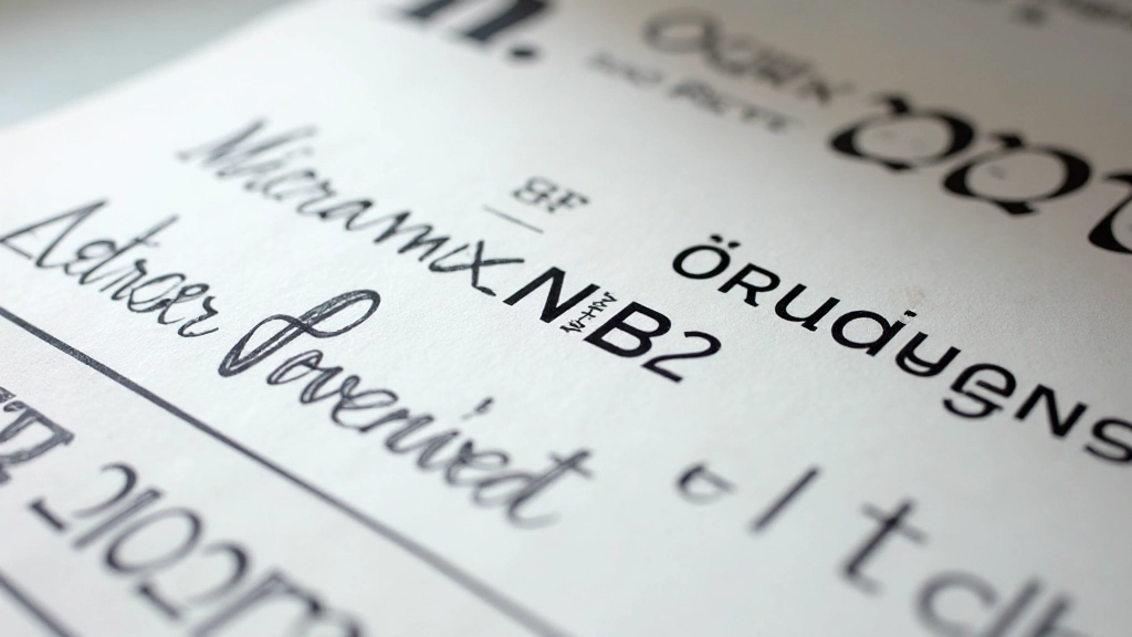
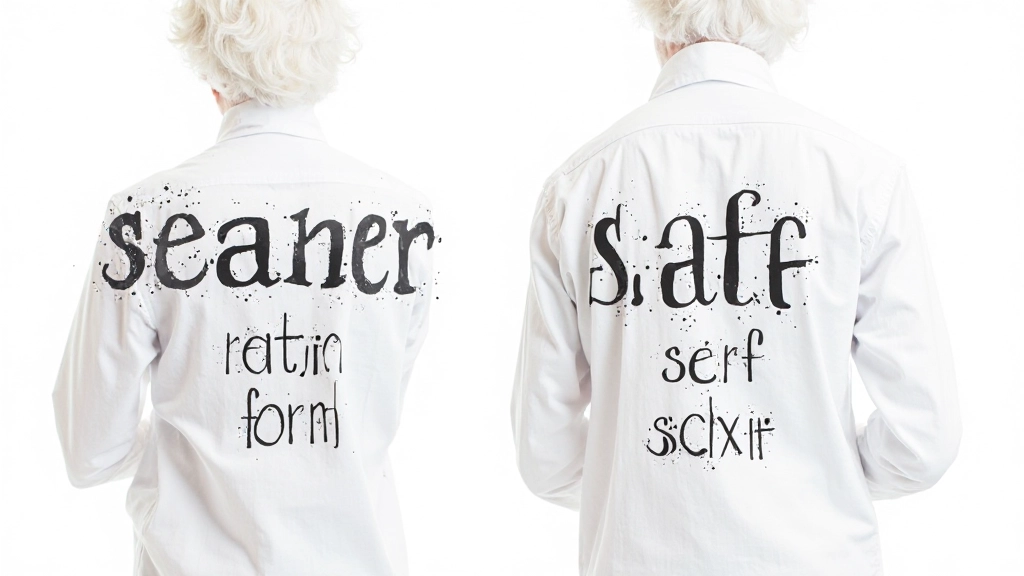
There are thousands of fonts out there, but they fall into two main camps: serif and sans-serif. Understanding the difference is your first step.
Serif fonts have little feet on their letters — think Georgia or Times New Roman. They feel traditional, established, trustworthy. You'll see them in newspapers, luxury brands, and academic content. They're excellent for long-form reading because our eyes naturally flow along those little strokes.
Sans-serif fonts don't have those feet — Helvetica, Arial, Roboto. They're clean, modern, straightforward. They work beautifully on screens and feel contemporary. Most modern web design uses sans-serif because it's easier to read at smaller sizes on digital devices.
The key? Don't mix too many serif and sans-serif combinations. Stick with one for your body text, maybe a complementary one for headings. We're aiming for clarity, not complexity.
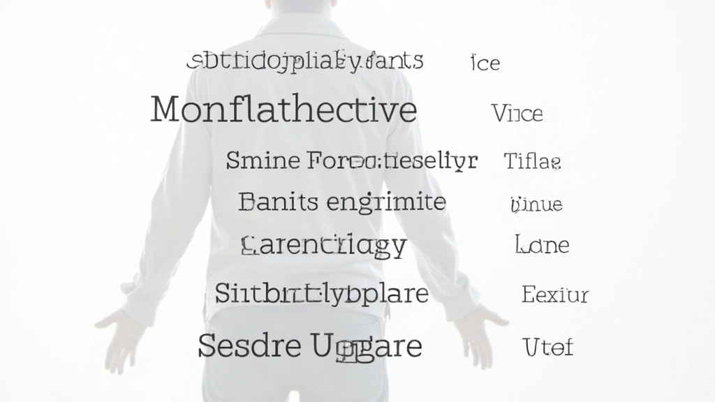
Creating Visual Hierarchy With Size and Weight
Hierarchy is how you tell readers what matters. Without it, everything looks equally important, and nothing stands out. That's a problem.
Start with three levels: your main heading should be noticeably larger — we're talking 32px to 48px minimum for web. Your subheadings maybe 24px. Body text typically sits around 16px, maybe 18px if you want to be generous with readability.
But size alone isn't enough. Use weight too. A 700-weight (bold) heading at 28px feels more important than a 400-weight heading at the same size. You've got light (300), regular (400), medium (500), semibold (600), and bold (700) to work with. Most of the time, you'll use just two or three weights per font family.
The golden rule: make it obvious what people should read first. Your eyes should naturally land on the headline, then the subheading, then the body text. That's hierarchy working.
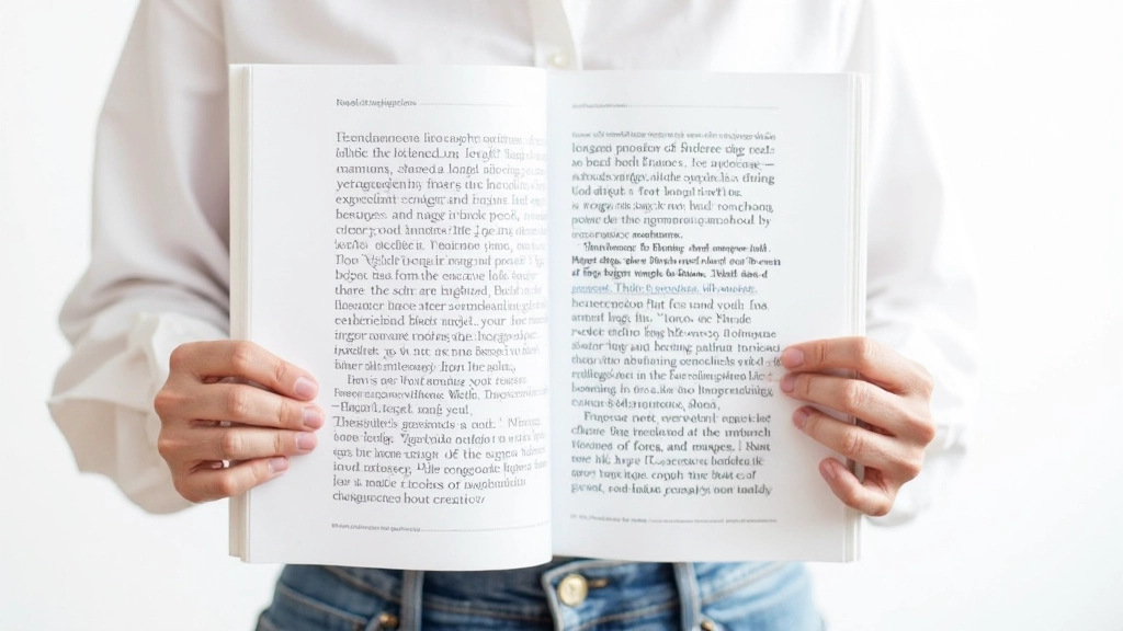
Line Length, Spacing, and the Rhythm of Reading
Here's something most designers get wrong: they make their lines of text too long. When you're reading across a really wide paragraph, your eyes get tired. You lose your place. You don't want to keep going.
Aim for 50-75 characters per line. On desktop, that's usually around 600-750 pixels wide for your text block. Yeah, that might feel narrow if you're used to full-width designs, but it's the sweet spot for readability. Your readers will thank you by actually finishing articles.
Line height matters too. Don't cram your text. Use 1.5 to 1.8 line height for body text — that's 1.5 to 1.8 times the font size. More breathing room makes reading feel less exhausting, especially on screens.
Paragraph spacing should be slightly larger than line height. If your line height is 1.6, maybe add 1.2em to 1.5em of margin below each paragraph. This creates a visual rhythm that guides people through your content naturally.
Font Pairing: The Art of Making Fonts Work Together
Not every font combo works. Here's how to find combinations that actually look intentional instead of accidental.
Contrast With Purpose
Pair a serif with a sans-serif if you're going to pair different families. A classic serif headline with clean sans-serif body text works because they're obviously different but complementary. Just avoid pairing two fonts that look similar — that just looks like a mistake.
Stay Within One Family
The easiest approach? Use different weights and sizes of the same font family. Roboto 700 for headlines, Roboto 400 for body. Helvetica bold for headers, Helvetica regular for text. This guarantees cohesion because everything's related.
Test at Actual Sizes
Don't just look at fonts in design software. Put them on your actual website at the sizes you'll use them. What looks good at 72px in Figma might feel awkward at 32px on a mobile phone. Real-world testing catches problems early.
Consider Personality
Does your font pair feel right for your brand? A playful geometric sans-serif might not work for a law firm. A formal serif might feel stuffy for a creative agency. The best typography combinations reinforce your message.
Typography Is Your Invisible Superpower
You don't need to become a typographer to get this right. You just need to be intentional. Choose fonts that work for your content and your audience. Create clear hierarchy so people know what to read. Give your text room to breathe. And test everything on actual devices.
When you nail typography, people don't notice it — they just enjoy reading your content. That's the goal. That's when you know it's working.
About This Guide
This article provides educational information about typography principles and best practices for web design. Font choices, readability guidelines, and design recommendations are based on established typographic principles and contemporary web design practices. Results may vary based on your specific project, audience, and technical implementation. We recommend testing typography choices with real users and monitoring readability metrics on your actual website. For accessibility concerns, always consult WCAG guidelines and consider testing with users who have visual impairments.
Continue Your Learning
Explore related topics in web design education

Understanding User Experience Fundamentals
Learn the core principles of UX design and how to create interfaces that actually work for real people.
Choosing Colors That Work Together
Practical guide to color theory, contrast, and accessibility for web design.

Building Responsive Websites That Look Good Everywhere
Step-by-step approach to making websites that adapt seamlessly from mobile phones to large monitors.